We recently encountered the work of Berlin-based photographer Dirk Müggenburg, who is best known for his remarkable still lifes and series of isolated shots from nature — all with a distinct cinematic quality and brooding mystique to them. His still lifes in particular are of an extraordinary beauty and predominantly the result of Müggenburg's obsession with flowers: both their inherent natural (decorative) beauty and the cultural position they hold. People use them as symbols to make statements of affection and mourning, which also means that people avoid them as they stand for vulnerability and doomed promises. It is very hard to view flowers as culturally neutral objects, for their vulnerable natural beauty arouse either admiration and desire or loathing due to cultural overexposure and negative connotations of kitsch. Müggenburg has explored this widespread hate-love relationship through a critical engagement with attraction, melancholia and sentiment in different series, all showing his extraordinary eye for detail and talent to create a distinct mood in his imagery.
The most diffuse series in his portfolio, aptly named 'Flowers of Delusion', is the one we love the most. As if taken behind a foggy window, the ensembles of flowers in vases are for the most part washed out over the frame, creating a photographic abstraction in the natural, pastel-like, color palette, without ever taking it beyond recognition. It is still very clear that this are flowers, but Müggenburg creates an atmosphere as if he is searching for a way to free them from their wide cultural affect — restoring what in our eyes is still the essence: extraordinary beauty. [ Continue reading ]

We have been deeply fascinated by the traditional Japanese art of repairing broken pottery with lacquer dusted or mixed with powdered gold, silver, or platinum named 'kintsugi', from the moment we discovered it while researching for our optical project, which eventually became our neo-luxury brand Mottainai. Recently we discovered a next level of kintsugi-use, when we encountered the beautiful work of Korean artist Yeesookyung, who masterfully uses the technique to create incredible imperfect sculptures: biomorphic yet still elegant works, composed from mismatched porcelain through the centuries-old Japanese tradition. Her first series in the style, now 16 years old, titled 'Translated Vase' was inspired by a different artisan tradition, from her home country Korea, where porcelain works that are not deemed sublime are systematically destroyed. From that first series on, she has continued to make the fused pieces to growing international acclaim. Intrigued by these tossed aside works and shards, Yeesookyung began saving fragmented tea cups and pots rejected by contemporary masters. Honoring the works’ dismantled states, merging the unwanted works together in a way that heightens the beauty of their distress. In this way she blends diverse methods to form a contemporary process that evokes both the elegant designs of her homeland and the delicate rebuilding of damaged works in the Japanese tradition perfectly marrying aesthetics and craftsmanship. [ Continue reading ]

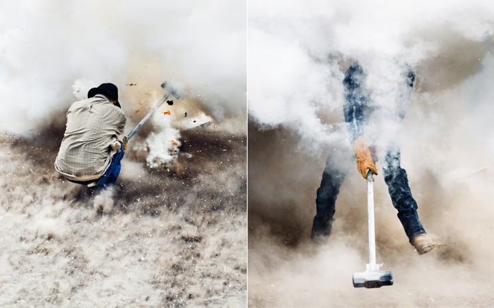
At the end of last year, the highly remarkable series named 'Bomba', shot by the very talented American photographer Thomas Prior, has been presented as a beautiful book by Dashwood Books, which turned out into one of the more interesting releases we have seen recently. 'Bomba' takes the viewer to the Mexican town of San Juan de la Vega, where every February its people gather together to commemorate a four-century-old battle that occurred between the town’s namesake and the area’s landowners. The story goes that Juan de la Vega, a wealthy miner and rancher, was aided by the saint in recovering gold stolen by bandits. Residents took up exploding sledgehammers to commemorate the victory over the thieves. And so, on so-called 'Fat Tuesday', in the middle of a football pitch in the town, packets of fertilizer and sulfur explode into clouds of dust and shrapnel. Today the tools are reinforced with rebar, and the celebration features blasts but now more flying hammer heads. Hundreds of local men strap homemade potassium chlorate fertilizer-based explosives to the heads of sledgehammers and slam them against the lengths of steel rail.
The isolation Thomas has achieved in the imagery, emphasizes the danger and violence of the peculiar tradition. With the clouds of phosphorus smog surrounding each of the men, the subjects are erupting out the cloud, with the rest of the background misted out erasing all kind of context. This could be a scene out of a war if one wouldn't know better. The result is an ambiguous surreality within the series -and the festival as a whole- as it’s still not totally clear where this salute to Juan de la Vega originally derived from, which makes it a series we can't take our eyes from. [ Continue reading ]
...,staat for Cartier at De Bijenkorf in Amsterdam

With Joachim's decision to merge Atelier Joachim Baan with his frequently collaborator, creative design agency ...,staat, and myself taking a position at the newly formed Amsterdam-based cinema juggernaut New Amsterdam Film Company since the beginning of 2017, there very likely will be a significantly broader scope of projects we worked on that will be passing in review here. (Next to all the exciting exclusive Another Something projects that will take shape in the coming months, of course.) The first hugely exciting project (that Joachim worked on) comes from ...,staat, who just presented an extraordinary creation for French luxury house Société Cartier at their corner window at luxury department store De Bijenkorf. [ Continue reading ]
Studio Job at the Carpenters Workshop Gallery in Paris

We have been off to a slow start here (not elsewhere), but with some very exciting meetings ahead in the coming months (stay tuned!), there will be an even stronger overal shift to ‘Less but Better’ in this year. Nevertheless, we will start picking up the pace from here, still sharing those things that continue to move us — today putting focus on the infamous Studio Job once more. As part of the Carpenters Workshop Gallery's ten-year anniversary programme, last week the gallery with three locations worldwide opened its Parisian space for the public to an exclusive exhibition by Job Smeets and Nynke Tynagel, which might very well be the most impressive display of their holistic practice till date.
Entitled ‘Here There Nowhere’ the exceptional solo show presents new creations, some of the most emblematic pieces that the duo created over the last few years and, very excitingly so, for the first time it opens up the drawings that form the basis for most physical creations to the public. The result is a highly diverse constellation of the fascinating creatures, iconic hybrid forms and ironic objects that punctuated with iconographic references — forming a kitsch and fanciful world where the object transcends functionality with everything bound together by the ‘Neo-Gothic’ aesthetic, masterfully championed by the Dutch power duo. When in Paris, ‘Here There Nowhere’ in a must visit! [ Continue reading ]

To celebrate the fact that lunatics can become presidents: we bring you this deadstock vintage canvas money bag, hand-customized by our close friend and typographer Guido de Boer. [ Continue reading ]

The tremendously talented photographer Constantine "Costa" Manos, who joined the roster of the legendary Magnum agency in 1965, first began taking photographs while in high school when he joined his school's camera club. Within a few years after discovering the art form, he actually becomes a professional photographer and at 19 he gets hired as the official photographer for the Boston Symphony Orchestra at Tanglewood, published into his very first book 'Portrait of a Symphony' in 1961. From 1961 until 1964, Manos lives in Greece, the country of birth of both his parents, photographing the people and landscape. Subsequently he returns to the USA, living in Boston. Where for instance in 1974, Manos was hired by the city to create the photographs for the prestigious 'Where's Boston?' exhibition: a large production in honor of Boston's 200th anniversary.
Decades later, in 1995, after having worked relentlessly for all those years, Manos' work finds a totally new audience when his iconic series focussing on the American people named 'American Color' is released. In 2010 he presents his second series of the same kind: 'American Color 2', which once more shows the extraordinary talent of Manos and has been a favorite of ours for years. As the name suggests, the photographer succeeds marvelously in creating incredible colorful images, portraying as much what is actually touched by the sun as what isn't, with most people in the frames hidden in stretches of shade to a slight surreal effect. Every one of the highly captivating images, succeeding to show one highly coherent signature, portray a America in all its richness, represented from a truly unique perspective of a great American photographer that still needs to be discovered by many. [ Continue reading ]


