Stüssy Biannual Vol – 7
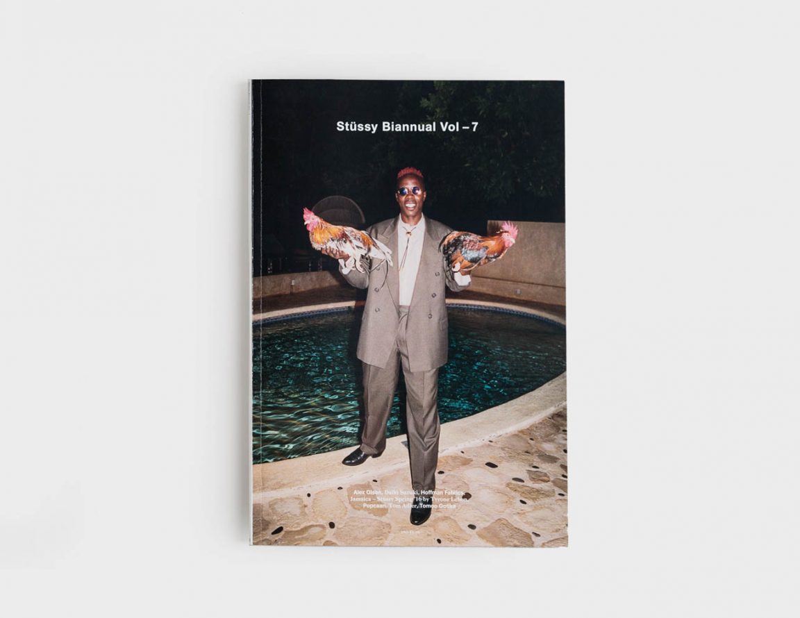
Last month, iconic Californian streetwear brand Stüssy presented its 7th seasonal Biannual — the magazine that celebrates the new upcoming collection. Where initially it stopped at being only that, over the years it has grown into a standalone publication in which the whole context around the brand is shared rather than just focusing on its own products and stories. It changed radically with Vol – 6, when the very talented Ryan Willms (of the recently stopped Inventory Magazine) took over as the editor of the magazine. Next to a new framework for the scope of the content, Willms’ vision also included a new aesthetic for the publication to communicate the new ambitions for the Biannual. All of these elements put together makes the just released Vol – 7 a wonderful standout, the best they have put out so far, promising a lot for the future.
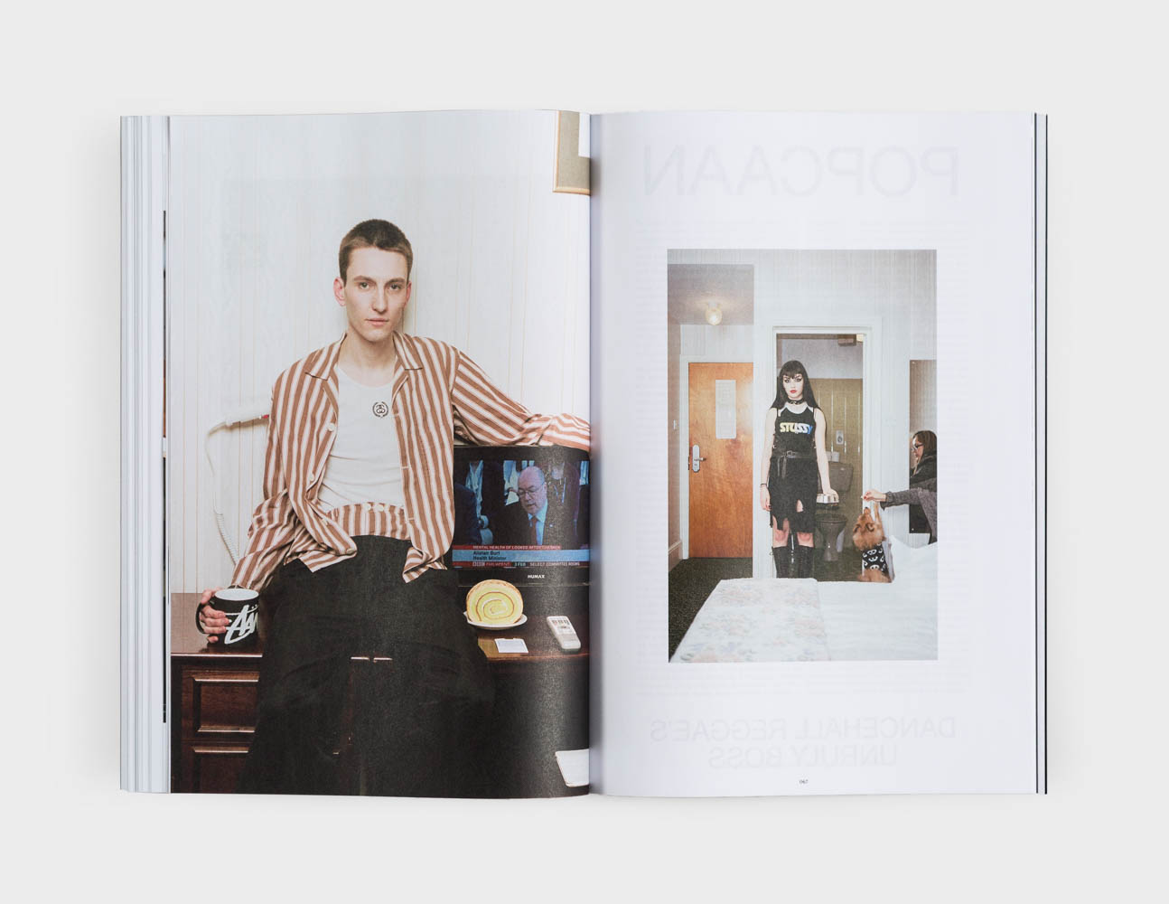
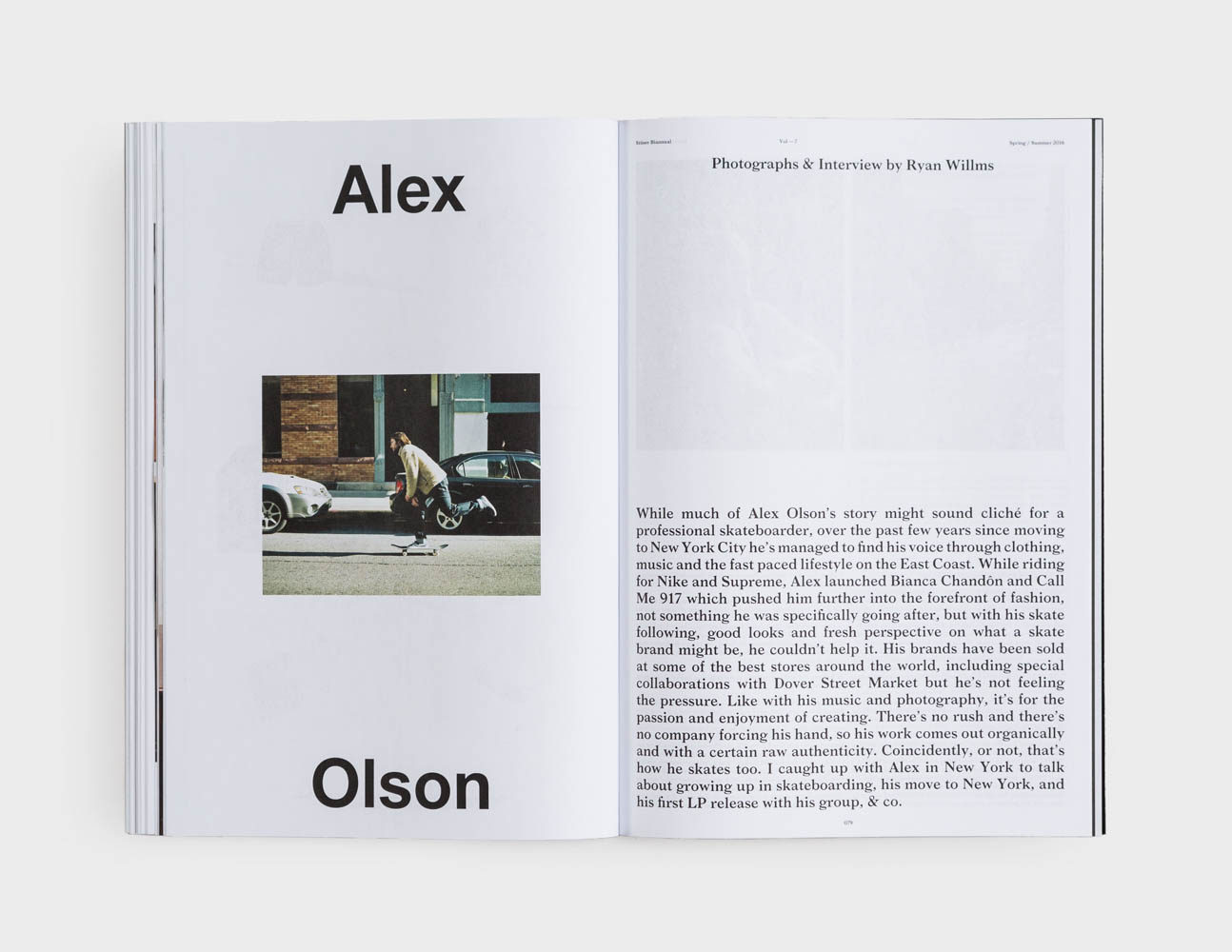
On the pages of the magazine its reader is taken to the island of Jamaica, which has been an inspiration for the brand from the very start through its rich culture, music and grounded lifestyle. On the island, photographer Tyrone Lebon shot his fourth series for Stüssy —very likely his best— exploring Jamaica’s great variety, spending time between Port Antonio and Kingston. Immersed into the Rasta, Reggae and Dancehall cultures of the island, the images convey an honest and exciting perspective of the country. Also dancehall superstar Popcaan is represented on the pages of the magazine. Next to these stories one will find enfant terrible and Bianca Chandôn mastermind Alex Olson, publisher Tom Adler (California Surfing and Climbing in the Fifties!), collage artist Tomoo Gokita, fashion designer Daiki Suzuki, and Hoffman Fabrics, alongside features photographed by James W. Mataitis Bailey, Antosh Cimoszko and Joyce Sze NG in the magazine.
To learn a little more on the interesting new creative direction for the Biannual we connected with Ryan, who in turn gave the word to the brand’s in-house designer Chris Glickman, who was kind enough to answer some questions from us right before he took a trip to Japan.
You joined Stüssy in-house last year, which was just before the new design direction for Vol – 6 was being created. Was that actually your first influence on pushing things in a different direction or was that set out already?
Chris Glickman: When I joined Stüssy the design of Vol – 6 had just been completed and was largely the influence of Ryan Willms taking over as editor. At the time he was working with a designer he had previously worked with on Inventory Magazine and they did a great job rebuilding the content and overall concept of the publication, much of which was carried over to Vol – 7. We’re aiming to push it overall in more of a cultural magazine direction and leave behind the feeling of a brand catalog. We’ve started working with a wider range of talented contributors which has made for more interesting content and will continue to evolve.
And how does it reflect in the new Vol – 7, which follows clearly the line of 6, but seems to be more balanced?
CG: Vol – 7 from a design and art direction point of view was all about rebuilding the structures we were working with and finding ways to make it more substantial for the reader. We rebuilt the grid system, changed the typefaces we were working with and switched to a perfect bind for the first time. For me the first issue of any redesign will always be a way of setting the stage for future issues. Now that the reader understands the visual language we are working with we can start to play with it.
The new aesthetic has moved away from a grunge-like rooting into a more modernist grid, what are your personal inspirations when it comes to (graphic) design?
CG: Stüssy has a really rich and diverse history, especially when it comes to which sub-cultures have adopted the brand and the aesthetics they gravitate towards. In some ways the design is more of a crystal goblet approach, allowing the reader to focus on the content itself without too much being projected on them. We will always be injecting some of our DNA into the design and keep it fun and interesting, but we don’t want the reader to pick up the magazine and feel alienated by the design because it clearly wasn’t intended for them.
My personal inspiration for the publication is varied. Though we moved away from a grunge like aesthetic I wanted it to feel a bit DIY and keep it’s rooting in California. There will be some influence from the skate magazines we read growing up and early music magazines, but it’s refined structures are very much a reflection of the many great magazines and journals on the market today.
And does the new visual language signify a new direction for the brand overall?
CG: The new visual language represents what the creative team at Stüssy have been working on for a long time. They are pushing continuously to produce better and better product. All that I am doing is taking their ideas and translating it into a clarified visual identity.
What else can we expect from Stüssy communicational design-wise, anything special you can share?
CG: There is nothing that I can speak about in detail now, but there will be some special projects coming out, all of which will have their own sub identities attached to them. We are already working on Vol – 8 as well, which is ramping up to be the best issue yet.
You can order the Stüssy Biannual Vol – 7 here
For Stüssy’s Spring/Summer 2016 collection see here